

I tried out some new coloring techniques here- I used Prismacolor markers given to me by an exceedingly generous artist friend. I really like them, but I need to learn how to test and use them before I go too far into them on a regular basis. I threw away several images because the markers were too dark or bright =(
 |
| Sorry it is a little blurry. Hope the colors and design come through. |
 |
| I plan to color this in with markers before I am finished. |

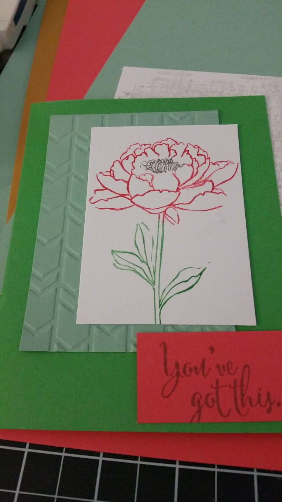
It's really hard to see in this picture, but there are DOTS embossed onto the minty green paper behind the flower.

I am really liking this set of colors. There is a taupe that I wasn't crazy about in the package, but once I used it, I changed my tune. It's neutral but has enough depth to it to be used in many different ways. I have also become a HUGE fan of the slate color instead of black as a neutral. It has a softer, more personal look that I adore.
I also found a card online that I am using as a reference/inspiration piece for something else. I bought a stamp set that is extremely similar to the images shown here, and so I wanted some ideas on how to use it.
